

Introduction
In a previous article, we explored how PCA can be used to plot credit card transactions into a 2D space, and we proceeded to visually analyse the results. In this article, we take this process one step further and use hierarchical clustering to automate parts of our analysis, making it even easier for our hypothetical financial analyst to find anomalies within their data set (for a review of the data set being used, make sure to check out the first article in our series).
Clustering
Clustering is an unsupervised machine learning method where data points are grouped together according to a given “distance metric”. Usually this defaults to euclidean distance, though other distance functions exist (such as cosine similarity) depending on your application. There are a large number of clustering algorithms, such as DBSCAN, Hierarchical Clustering, and even a hybrid of the two – HDBSCAN. the Orange library implements hierarchical clustering, so we will use this for demonstration purposes in the rest of this article.
Results
After running the algorithm, and selecting the top 5 clusters, we see the following results:
The data points are organised hierarchically into a tree with each tree leaf being a cluster. The Orange library helpfully splits each cluster into separate colors (on the right hand side), so one can easily discern which data points belong to a cluster.
We will plot these cluster colors onto our original PCA scatter plot in order to better compare the two and more easily absorb the extra information that the clustering algorithm gives us:
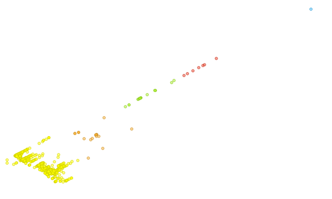
As expected, the clustering algorithm grouped most of the points in the lower left corner together in bright yellow. We discussed in the previous article about how the PCA algorithm is heavily influenced by the “total” data attribute since it introduced the most variance in our data set, so we expect that the clustering algorithm will also be highly dependent on the “total” attribute.
In the previous article, once we processed our data set using PCA, we noticed one extreme outlier, due to the “total” value of this outlier being far higher than that of the other data points. This is reflected in the clustering results by a cluster containing a single point:
The first point is the only point in the light blue cluster, while the entries below it make up another small light red cluster. These entries represent those entries in our data set where the “total” value of the credit card transfer was higher than is usual for other transactions in the data set.
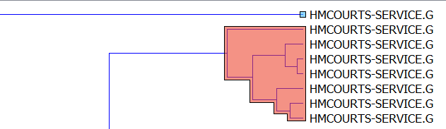
Looking at the next (light green) cluster, we spot an anomaly that managed to make it past our manual analysis in our previous article:

The first data point in the cluster is labelled “Harold Benjamin Solicitors“, while all the rest are from the expected “HMCOURTS“. If we check the raw data set, we see that this entry has a total of “2124”, which is well over the average total normal seen in our transactions. Therefore we can now add quite a specific anomaly to our already discovered ones: that an abnormally high payment has been made to “Harold Benjamin Solicitors”, because usually such high payments go to “HMCOURTS”. However, there is a high probability that this observation is a false positive (i.e. not really an anomaly), because we know that solicitors do in fact tend to charge large sums of money, and because this data point is the only transaction in our data set which is going to the solicitors, we have no frame of reference to decide if this is an abnormally high payment in the context of solicitors or not (incidentally this highlights why it is difficult to work with “imbalanced data sets” – or data sets where different classes of data do not have adequate representation.
Conclusion
We’re at the conclusion of our three-part series, and hopefully you now have a better understanding of how correspondence analysis, PCA, and clustering work.
We’ve seen that since correspondence analysis works directly on tabular categorical data, it is easy to apply it to data which is already in the form of a table, and it highlights relationships between the categories in your data. PCA on the other hand, is more heavily influenced by those attributes which introduce the highest variation in your data. It is very good in helping to highlight those anomalies that are present within this highly variant attribute, but you may miss some of the relationships within the data – so it’s always better to investigate your data with more than one algorithm and merge the results in your reporting.
While clustering was also highly dependent on “total” – so it did not give us the more subtle insights which Correspondence Analysis did – it was a very useful addition to plain PCA since it helps an analyst to quickly data into more manageable chunks which makes anomaly detection easier, as was the case with our solicitors payment in the above example.
Previous Articles in the Series
Analyzing credit card transactions using machine learning techniques – 1
Analyzing credit card transactions using machine learning techniques – 2

You must be logged in to post a comment.