
Grafana Loki (https://grafana.com/oss/loki/) looks like a viable alternative to Elasticsearch and has an excellent pedigree, but how does it stack up with Elasticsearch, especially when using it in a SOC perspective?
Getting Setup
This was a breeze compared to Elasticsearch (which itself is also really simple to setup). The test stack consisted of
- Promtail to collect logs (“agent” of the stack – equivalent to a “beat” in the Elastic world)
- Loki to gather the logs (“server” of the stack – equivalent to Elasticsearch itself)
- Grafana to visualize the logs (“UI” of the stack – equivalent to Kibana)
The performance of the ecosystem is impressive, with the main downside IMHO being the less intuitive setup of visuals in Grafana when dealing with Loki data sources. However, this is not out main focus. This article aims to document a couple of graph setups which I missed having coming from a Kibana-world, and which took getting over a small learning curve – hopefully serving as a good starting point for others making the journey
For the rest of this article, I will be working with standard NGINX access logs which have been shipped to Loki via promtail
First Look

Grafana comes with a handy “Explore” tab which display a screen similar to kibana showing a histogram on the top half (1) and logs in the bottom half of the screen (2). A feature missing from kibana is the rather handy dedup (de-deplicate) which reduces log clutter by aggregating similar logs (3).
If you enter the right query (4), Grafana allows you to filter on fields in a very similar manner to kibana (5). In a nice change of pace from ELK, logs do not necessarily need to be parsed during ingestion in order for these fields to be present. The log can be parsed during query-time, as is the case in the screenshot above. The log query used is:
{job="nginxlogs"} | pattern "<ip> - - <_> \"<method> <uri> <_> \" <status> <size> <_> \"<agent>\" <_>"
The above leverages the “pattern” feature, and a very good explanation is present on the LogQL documentation here
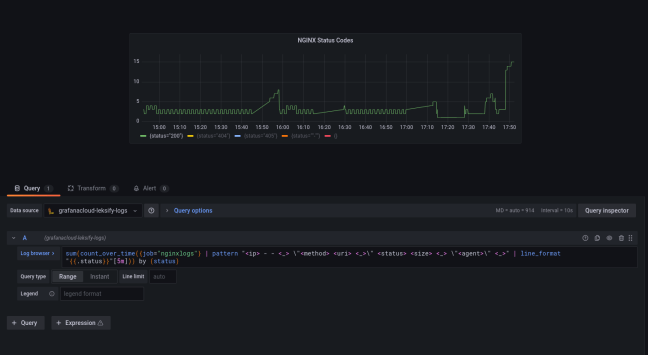
Frequency per status code
On of the first graphs I want to generate is a line graph showing the frequency of occurrence for every status code. This is a fundamental graph in terms of SOC since it allows you to quickly:
- Identify spikes in 200 OK traffic which can be DoS, bots, scraping, or legit activity
- Identify spike in 4xx traffic which can indicate brute force or forced directory browsing
- Identify lack of traffic showing availability problems
To be fair, this is where Kibana shines, because given you have correctly parsed the fields it’s very easy to build the graph. Grafana is a lot less intuitive, but it gives you a lot more control and flexibility. The end result looked like this:

A closed look at the query used:
sum(count_over_time({job="nginxlogs"} | pattern "<ip> - - <_> \"<method> <uri> <_> \" <status> <size> <_> \"<agent>\" <_>" [5m])) by (status)
In building the above, it helps to
- Refer to the LogQL documentation
- Regularly switch back and forth to the “table view” of your visualization
- Build the query from the “inside out” as we’ll see shortly

(2) Count_over_time counts the number of occurrences of log entries over a given range of time – [5m] in this example
At this stage, running the query shows a graph like this:
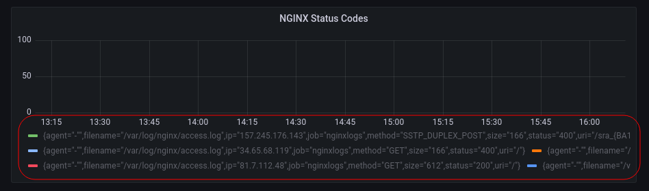
We’re almost there, but looking at the bottom you see the problem… grafana is splitting the time series based on each log line, whereas we want to group only by status. Which is why we add
(3) the “sum” operator allows us to use the “by (status)” clause that groups the sums according to the status code, giving us the results we were after
Table of most frequently visited URI
This is a related visual, instead we’d like to see a table of the most frequently visited URI paths on our server. There is one fundamental difference between a table and the line graph we constructed previously:
A line graph is a time series, while a table is a snapshot, or an INSTANT in time
This is an important distinction because the LogQL query to build a table is only very subtly different from the one we just used above. The query in it’s entirety is:
sum(count_over_time({job="nginxlogs"} | pattern "<ip> - - <_> \"<method> <uri> <_> \" <status> <size> <_> \"<agent>\" <_>" [$__range])) by (uri)
The only two difference are emboldened. We changed “status” to “uri” to reflec the field we’re interested in, but we also changed our time range from 5m to the variable $__range. In other words, count_over_time is not going to split results into 5 minute buckets, but instead create a single bucket which is as big as the current time-range the dashboard is set to (more about the range variable here).
We’re almost there, but now instead of a time stream we have a single instance in time, so Grafana needs to be told that… which is what we do in (1) below. The use of the range variable is shown in (2)

Apart from tables, bar charts also follow the same pattern as described above. Below we can see a screenshot of the number of times a particular HTTP Status was returned depicted as a vertical bar chart:

That’s it! I hope this saves some hair pulling for the next person down the line 👍

You must be logged in to post a comment.